I gifted myself this book for Christmas. Fantastic stuff. 150 classic cartoons brought to living color. I loved MAD magazine as a kid with these little morality plays being among my favorite parts.
One of the most celebrated comic strips in MAD's history has a deceptively simple concept: twin spies, one clad in black and the other in white, outdoing each other in elaborately stupid plots to achieve the other's demise. Now, for the first time, MAD presents a new Spy vs Spy anthology celebrating 150 classic adventures in blazing full color.
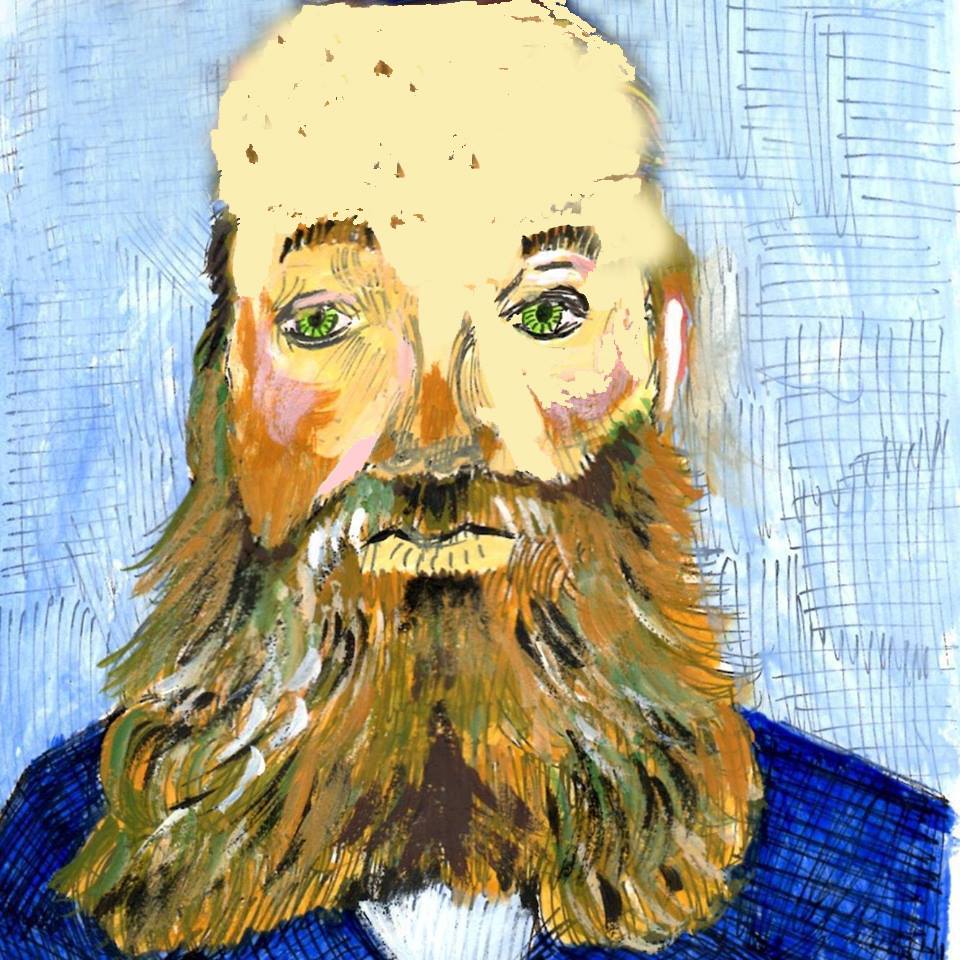
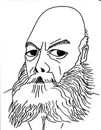
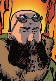
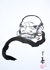
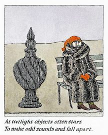
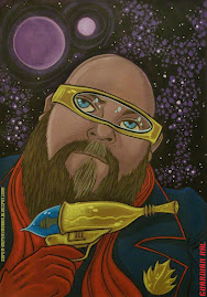
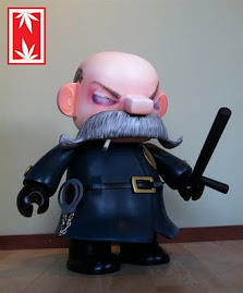
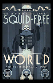
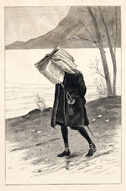
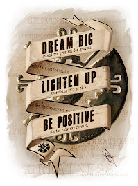
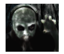
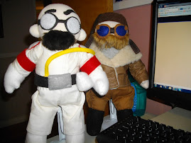
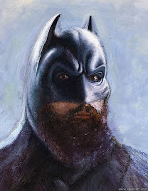
Bonus material created exclusively for this collection includes a foreword by superfan Lewis Black, Sergio Aragonés' illustrated memoir of the Spies' creator, Antonio Prohias, an ode to master cartoonist Peter Kuper, and new interpretations of the Spy characters by 15 acclaimed graphic artists: Orlando Arocena, Peter Bagge, Tom Bunk, André Carrilho, Darwyn Cooke, Evan Dorkin, Gilbert and Jaime Hernandez, Jim Lee, Hermann Mejia, Tony Millionaire, Nathan Sawaya, Yuko Shimizu, Bill Sienkiewicz, Bob Staake, and Rich Webber.
Additional special features include dynamic charts and graphs to deconstruct and quantify which spy has "won" the most through the comic strip's volatile history, the most popular weapons and ploys used in the strip, means of death, and more, plus a beautifully printed endpaper featuring David Anson Russo's interactive maze, where readers can play as either white or black spy.


























%20(002).jpg)


sdtb.jpg)


2 comments:
I wish I was more of a fan of MAD's post-facto coloring work. I just don't like how the classic Mort Drucker movie parody artwork looks when it's got all those new color gradients. Maybe the Prohias stuff fares better.
In my opinion, the very best Spy vs. Spy material is the stuff that was in those rack-sized paperback "originals" from the 1960s and 1970s. The whole vibe is different -- it's slower, moodier, and nastier. (And the art has room to breathe; it's usually one panel per paperback page, rather than having a bunch of them jammed together on a single magazine page.)
Also, the Peter Kuper material from after Prohias retired is excellent.
And of course there are the crazy Spy vs. Spy Mountain Dew ads, that were done by those wizards at Method Studios (who also did the "Ring tape" for Verbinski's American The Ring.)
I like it because it's like reading the gags for the first time in color. It's like when they colorized the FAR SIDE. It was just so much better. I wish I was a teen because I might have removed some of these posters to hang on my wall. They are very cool, different while still being iconic.
I love those MAD paperbacks. I had a chance at a box of them once but was poached at the last minute bid.
Post a Comment